實例 | 最多三步,改變你的字體容貌
作者:小道 编辑:道格字体&coeus
@
When I saw this title, I thought of Jay Chou's songs, and then I thought of the Chinese porcelain. The meaning of itself is more biased towards the Chinese style, and what the original author wants to express is the elegant and ancient style.
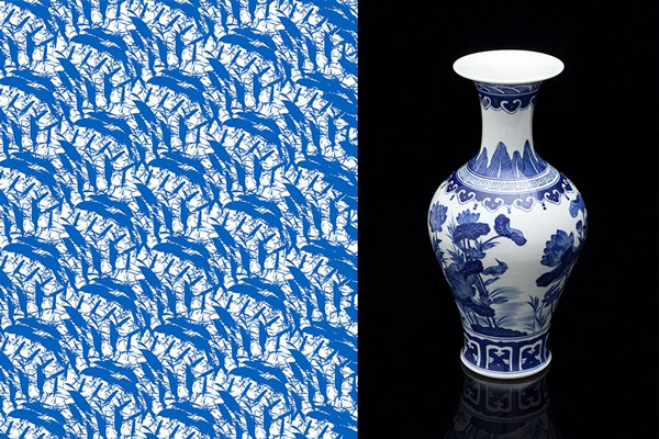
As shown in the picture above, some blue and white porcelain -related patterns and porcelain are found, first feel it.First of all, no matter what style of fonts you do, you must pay attention to the quality of the font. This requires many efforts. Let ’s take a look at the original works below.
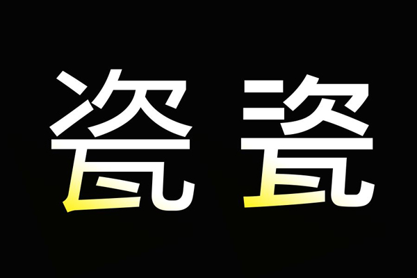
Is it a bit like an unearthed cultural relics at first glance? Let ’s analyze it one by one:
a.Some local processing of thin strokes is actually in line with the "Chinese style" mood, but the details of the strokes are trivial, like pulling out from ancient inscriptions;
b.The background "waistline" at the bottom is a bit too hot, and the outline lines are not soft.
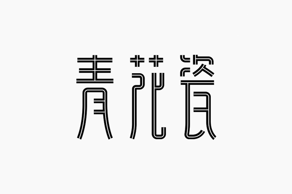
Use the pen tool in AI to outline the infrastructure of the text, the strokes of the equal line are clean and neat, and it is a bit more exquisite compared to the original writing strokes, which is more in line with the aesthetics of modern people.Many friends think that the change of the font is only the deformation of the strokes. In fact, the changes in structural space can also reflect the characteristics of the font.
Refined adjustment.Green characters are a shaft -hearted structure, so the structure is relatively easy to control; the places marked in the two places in the flower characters at first want to do complicated treatment, but compared with the two characters next to them, it is not smooth enough;After finishing, the vertical pen was added with some displacement and curves, but it looked a little muddy.
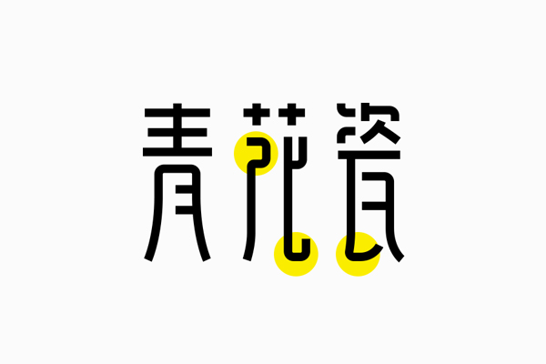
Knock out the text in the font, pay attention to the strokes in the lower left corner, the same strokes have many different processing methods.
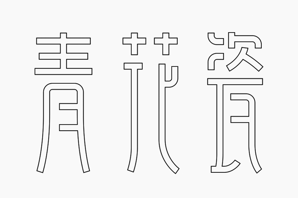
After adjustment, as shown above.In fact, there are not many deformations in strokes. The main feature is that there is an expansion of the lower part of the font, and a bit of writing.
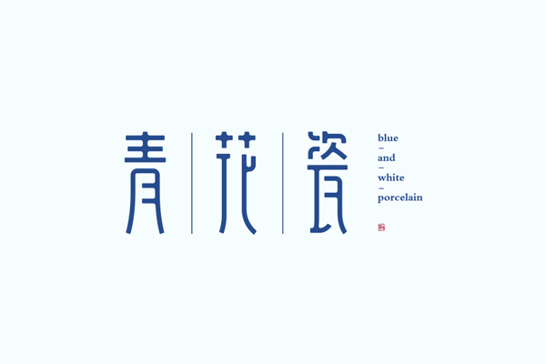
Fill the color and do a little rounded treatment to increase the roundness of the text, and the details are richer.
In the strokes, the author wants to find some changes. On the left, some strokes are common, but it is a bit far -fetched. On the right is the deletion of strokes, but the role of these changes is not obvious. Why?
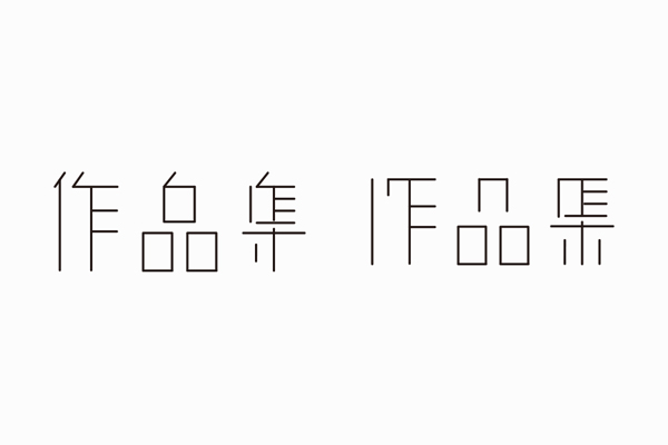
Both sets of characters are fine lines. Excessive strokes can easily make the font look light and have no sense of existence. The strokes will be greater. In this case, it is more reasonable to distribute the font space.

On the basis of the second group of words, adjust the distribution of font space. The last word is changed greater. The original connection method is changed.

Wording in the form of line segments can easily change the thickness of the strokes, so I do n’t know how much the strokes are more thick and detailed, which can be distributed together to compare and choose what they need.
Regardless of the style of the style, the differences between the different styles of right -angle and the rounded corners are relatively obvious. The text in the figure above is compared to the previous steps from the right corner to make round corners, and the whole group of characters is better.
The characteristics of the line segment connection method are free and flexible. You can easily make a variety of style fonts with completely different styles, because it is composition of equivalent strokes. Everyone should pay more attention to the distribution of space.You will like this method ~