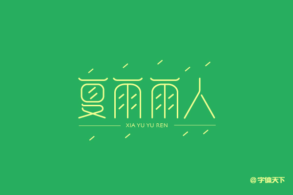
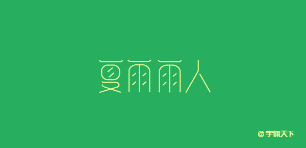
夏雨雨人字體設計創意
作者:小道 编辑:道格字体&coeus
Spring wind, summer rain and rain, expressing we must always be grateful.Xiaobian made a set of font designs based on this.As shown below:
Step 1. First draw the creativity of the font on the paper. The commonality of the font is found here. Except for the word "human", there is a horizontal part of the other fonts. Just draw a horizontal line in it and then copy other replications.Then use the AI tool to select a similar -style font as a reference. The advantage of this is that it is convenient for the font to first grasp the skeleton of the font.Use the pen tool to draw the basic structure of the font.
Step 2, adjust the strokes of good fonts, pay attention to the points in the rainy words that cannot be drawn too long, otherwise the font structure will appear too full.Adjusting the direction of the slope, the horizontal line in the summer character is also consistent with the slope in the rain.
Step 3. Many great gods like to use a pen to draw the arc directly. Here I prefer to adjust the corner to adjust the arc of the font, because such fonts are considered more regular fonts.More unified and neat.If it is a more publicized font change, you can use the pen to directly draw the arc.
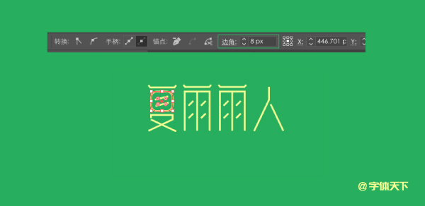
Step 4. To achieve the font of this discovery, the font of the design is too slender, you can adjust the width of the font, and it can be pulled directly. In addition, the thickness of the font can be adjusted at any time as needed.
Step 5. Finally, we add raindrops to the font to set up raindrops as an atmosphere, and with a skebon -free English font, so that the font design is complete.