作者:小道 编辑:道格字体&coeus
Author: Wang Mengqi authorized to reprint from: I am design wet
Many students often confuse the processing of the picture, and feel that they have got a relatively ordinary picture, without texture and tedious color.The last document made is too simple, but the effect of simply integrating information on the overall picture is not great in terms of visual effects.
So when you look at the design, you start to lament, how can the picture get so good, my life...

Indeed, we can't get such a good picture at all. Not all Party A is so rich, with professional models, professional photography, and professional marketing teams.But the question is, does Party A have money to do you?How cheap you are.Is there no point in my heart?
This tutorial we use five solutions to gradually tell you little by little, how much the influence of different picture processing on the overall picture is.So there are a lot of parts that need to be taken into account in a picture.
Picture processing, composition method, text arrangement group arrangement, color selection, graphic embellishment, we try to notice these aspects.
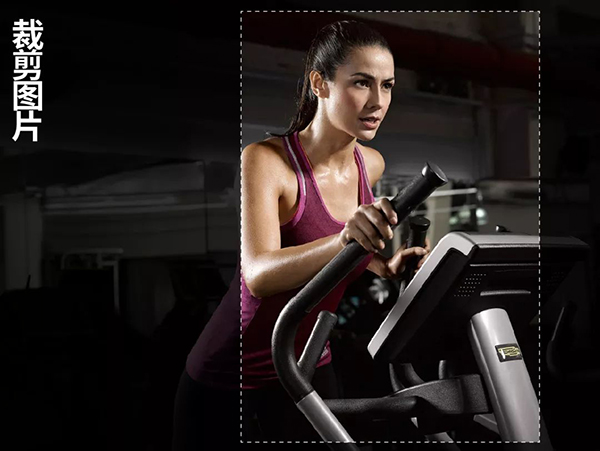
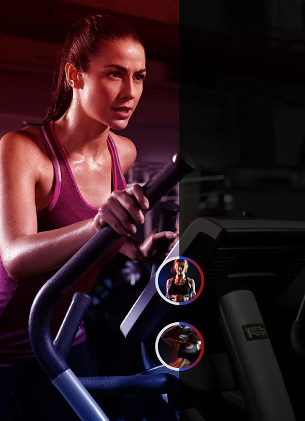
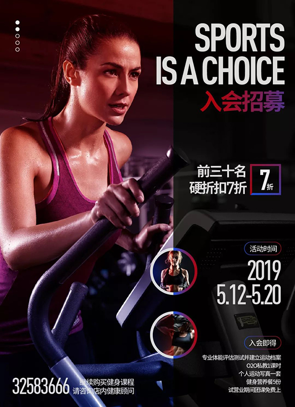
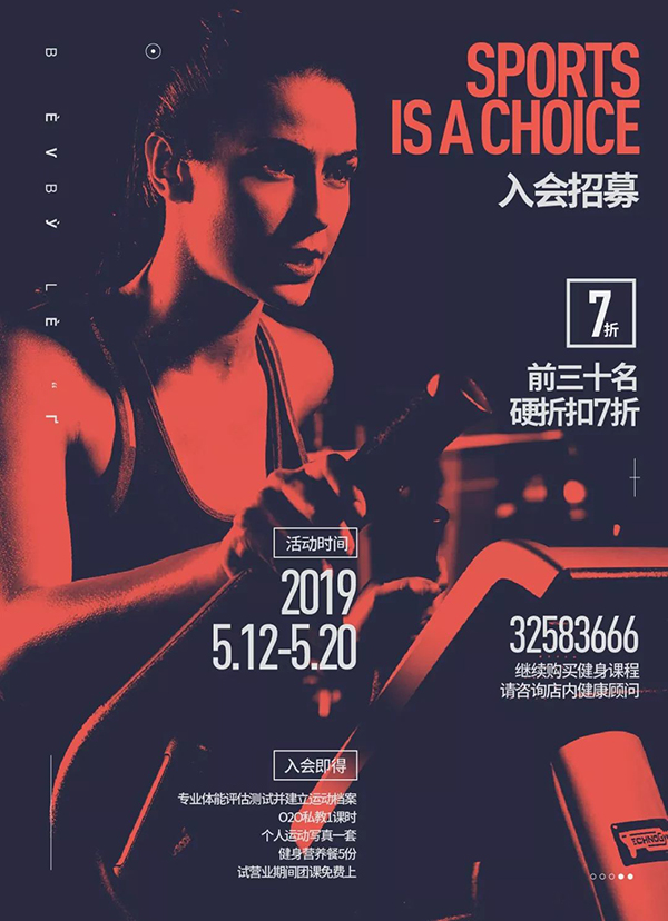
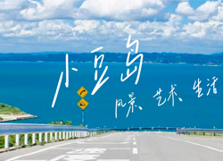
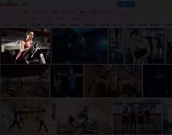
First of all, let's take a look at the picture we got this time. In order to pretend to be the quality of the picture, I did have a picture of Baidu casually.And it is the first diagram displayed, none of them.There are few people as sincere as me, pay attention to cherish.
Let's take a look at the copywriting. I will make it briefly this time. What is simple processing?It is to choose the font, match Chinese and English, the word re -selection, the word distance adjustment, line -adjustment, the information group, the level is clear, the word distance is opened, simple formalized, you see, it is that simple.
The processing of copywriting does not need to be particularly complicated. You should pay attention. In any case, we need to convey the information to the audience. Don't be trapped by yourself. When organizing the information, don't you think which important secondary important. From the standpoint of the audience.
If you want to go to fitness, what are the important things you pay attention to to the store, which are not important, and how are the sequence sequence divided?Think about it.
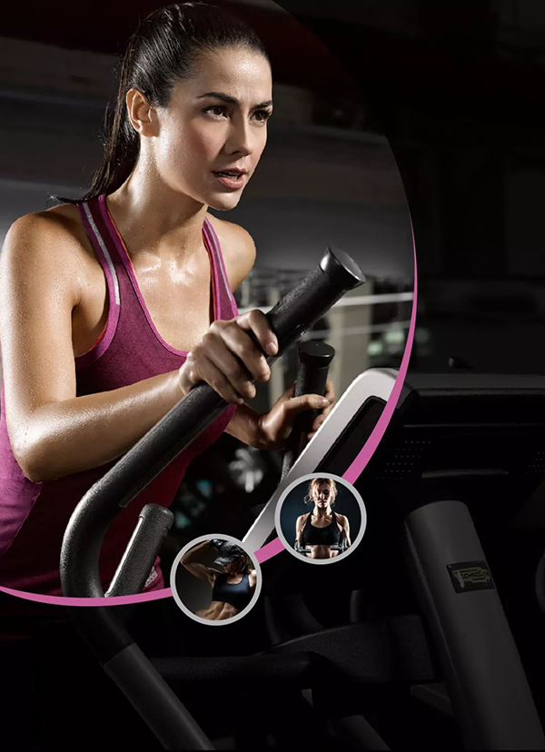
The picture we get is like this, so you have to observe. This is a character -based picture. The character is within a scene. Is this scene important?It is important, she is a state of sports in the gym.But we don't need to keep all this scene, just pick a part.Therefore, we have to cut pictures to let the picture focus on the main focus.Let the first sight stay on the character.
Then use a simple graphic to focus the characters in the secondary part, and I gave 80 % of the black transparency of the other part.Then add a small conventional decorative figure, two small pictures embellishment.
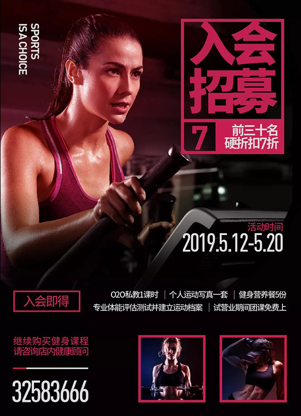
Then the copywriting is arranged in turn.
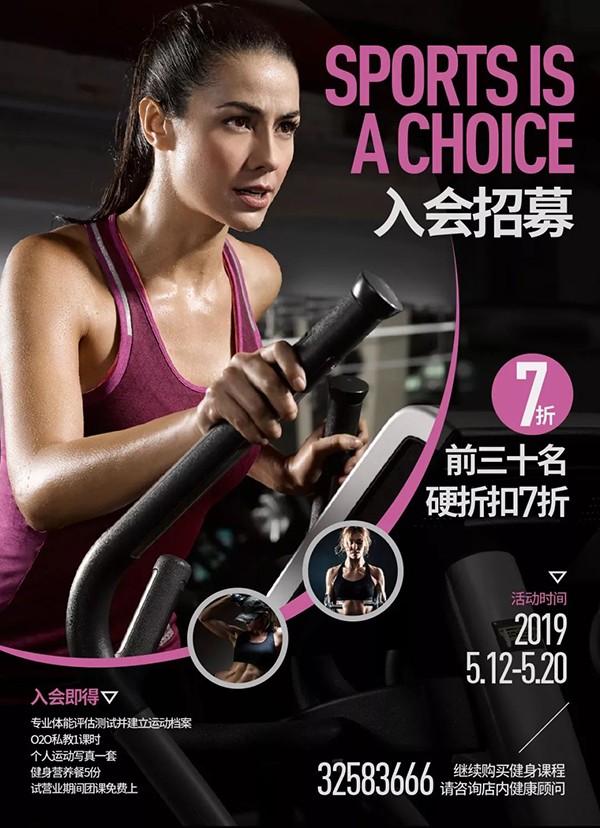
This very conventional direction.
To sum up, we use two methods we use.
01.Image cutting
02.The contrast of bright and dark highlights the main map again.

Then we have confirmed the cutting of the picture. Let's briefly demonstrate the second form of expression.
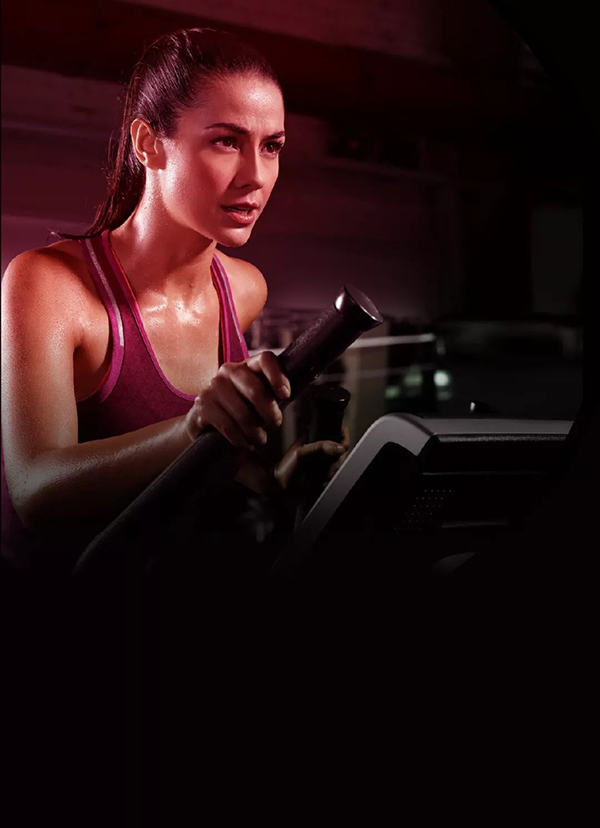
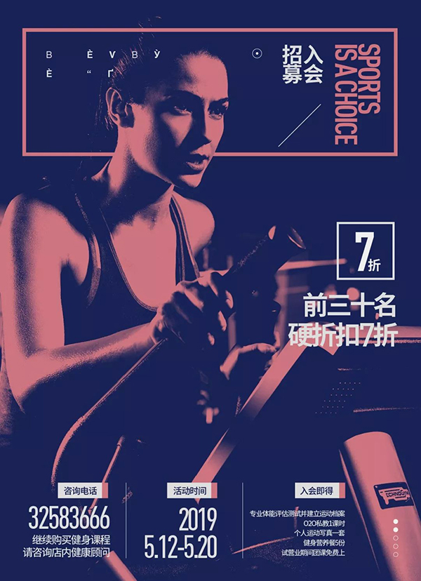
Let's take a look at this case. Using simple color superimposed pictures to deal with the color and texture of the picture, you don't need to do more complex color adjustment operations, which is very simple.
As can be seen in the figure below, first of all, I made a focus gradient for the picture, or the idea of the first plan. I gave all the black to transparent gradients, and the copywriting would be clearer.
Because the composition method almost changed from the left and right composition to a semi -surround composition, I adjusted a little bit in the copywriting part.
Compared with the first solution, is the texture of this case picture slightly improved a little bit?
To sum up the methods we mainly use in this case.
01.Image cutting
02.Gradient superimposed pictures (I use "soft light" here)
In the third case, we combined with case 1 and case two, and then we can break through a little more in color. I also conducted a simple sense of form of the two small maps.Texture.
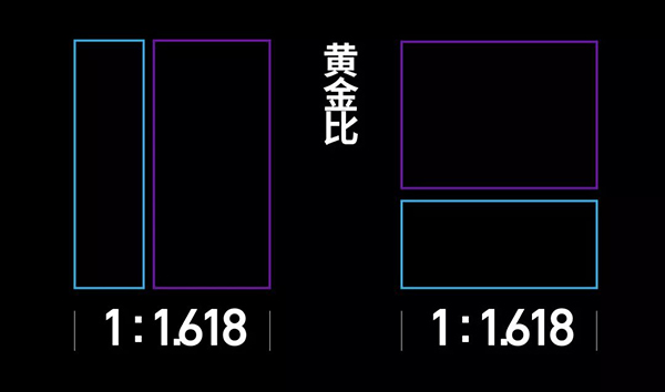
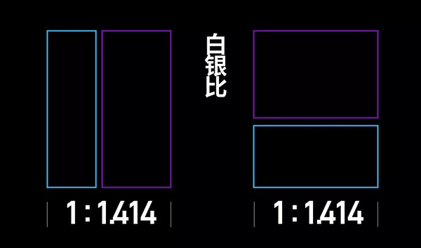
Some classmates have doubts. Is there any basis for the comparison of this left and right?That's right, it is silver ratio.
The golden ratio and silver ratio are commonly used. In Japanese posters, we often see silver ratio.
But don't use it blindly. If it is appropriate, you can add it. Don't force it.
It's far, let's take a look at the final effect of this case.
To sum up the methods we mainly use in this case.
01.Image cutting
02.Gradient superimposed picture
03.Bright and dark contrast again highlight the main map again
04.The picture is divided into two parts to do silver ratio
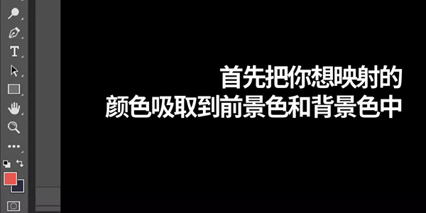
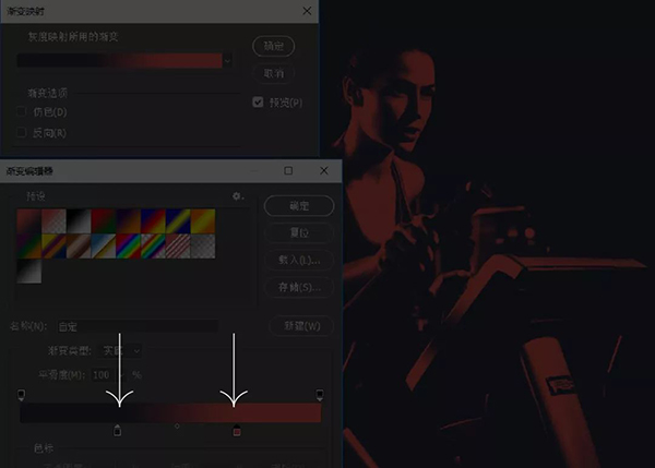
In the fourth case, we mainly say a very important color adjustment function ---- Gradient mapping
This function is completed in PS, which is also a relatively simple and practical method.
Then the image -adjustment -gradient mapping, after finding this function, starting the details, all the way to the effect you want, I mainly want the bright and dark contrast of the character here.
The final effect after adding copywriting.
To sum up the methods we mainly use in this case.
01.Image cutting
02.Gradient mapping
第五个案例其实是为了加深大家对于Gradient mapping这个功能的理解,换了一种颜色和排版方式重新演绎了一下第四案例的方向,你会发现以上这些案例中我主要用到的构图方式基本还是左右构图,而且人物一直是在左边,这个因为人物的目光是最好是能覆盖在文案上,受众会沿着人物的目光方向来阅读文案,也是一个小细节。
然后这个案例中,我用了一个简单线条与人物之间做了一个穿插关系,Some classmates are about to ask, what is your English that you can't understand?It's right if you don’t understand. If I want you to understand it, it is an important message. If you don’t understand, then it is just a simple decorative role.侬晓得伐?
To sum up the methods we mainly use in this case.
01.Image cutting
02.Gradient mapping
03.The relationship between lines and characters
Okay, let's talk about this this time, see you next time.