They all like to design in English. What's wrong with Chinese characters?
作者:小道 编辑:道格字体&coeus
We may all have had the experience that when we saw some product designs printed with Chinese characters, we would suddenly lose the desire to buy. Even some big brands can not escape this psychological gap, such as LV or Louis Vuitton looks very advanced, once the advertisement plays"Louis Vuitton", it simply has its own local flavor. Some time ago, airbnb officially certified the Chinese brand name as"Airbnb". How many people cried that they would no longer book accommodation in Airbnb?
is it"the moon abroad is relatively round", so we instinctively resist the appearance of Chinese characters in product design? Many people flock to foreign brands, customers and designers are careful, lest accidentally use the wrong Chinese characters to lose the hearts of users. But this is not the main reason for rejecting Chinese characters in the design. What on earth causes such subjective perception? Is the Chinese character in the design really a minefield that cannot be stepped on?
the more familiar words are, the more likely they are to bring a sense of bargain. Let's try to recall that when we see a product with Chinese characters, whether it's packaging, T-shirt or brand logo … The first time will read the literal meaning,"what is this?""what does it mean?" And continue to extend the further meaning.
for example, when the word"green" is printed on a T-shirt, the first thing you see is not font design, font typesetting, pattern matching. It's capitalized"green". In our view, this is not the design of graphics or symbols, but the familiar text. It is this innate habitual cognition that leads to the sense of cheapness caused by our over-interpretation of Chinese characters.
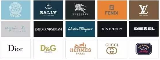
in foreign countries where they are accustomed to English, they also instinctively resist the direct use and simple interpretation of English. Many European and American brands prefer to choose capital letters or self-created word combinations in Logo design and product design, such as GUCCI, COACH, NIKE, CHANEL. Although English is the main body, it is an original combination of letters, which can not interpret the meaning of letters at a glance, and avoids the sense of cheapness caused by familiarity.
it is precisely this cultural and psychological deviation that we will find that many foreigners love Chinese character design. In their view, how wonderful the existence of Chinese characters is, the rich font expression, the mysterious culture of the ancient East, will not deliberately understand the meaning of Chinese characters, but as a graphic or symbolic expression. Even, many Chinese characters that seem strange to us will be worn by foreigners and tattooed in Chinese, such as"stupid" and"pussy". They seem to have a different kind of symmetrical beauty.
distance produces beauty. In design, designers need to do how not to let the design be interpreted at first glance. The human brain has a complex and magical structure, and the slower the cognitive response to something, the better the design. From this point of view, are Chinese characters really useless? Can Chinese character design only be linked to the sense of cheapness? Of course not, oriental charm, Han and Tang style, how can it be summed up in one word.
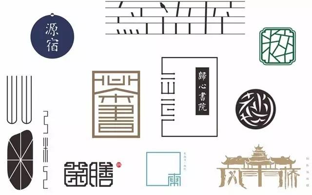
when we learn how difficult it is to reverse the familiarity of Chinese characters and create beautiful and concise Chinese character designs, some designers may choose to give up and continue to use simpler and more common English or even other foreign languages. let users easily generate graphic symbol cognition. However, this also restricts more possibilities of design.
when we are limited to the functional meaning of Chinese characters, we forget that Chinese characters themselves are the existence of beauty. The beauty of Chinese characters, famous all over the world, accumulates five thousand years of ancient inheritance of Chinese culture, from pictographic symbols to Zhuan, Li, Kai, and cursive styles, and from the continuous evolution of pen, structure, shape, etc., constitutes the beauty of freehand brushwork form of Chinese characters. The vivid and ever-changing charm of the font is a rare art of writing. However, in design, we are seldom willing to use Chinese characters. Isn't that a pity?
the more difficult it is to design good-looking elements, the more incredible charm can be exerted through good design. It is the existence of Chinese characters that tests the professional ability of designers and the design spirit that they strive for.
in terms of aesthetics, traditional Chinese characters are better than simplified characters. The emergence of simplified characters is to meet the needs of cultural popularization. It is precisely because simplified characters are too familiar, use traditional characters in design, design changes from their shape and meaning fonts, and make them more inspirational and creative space.
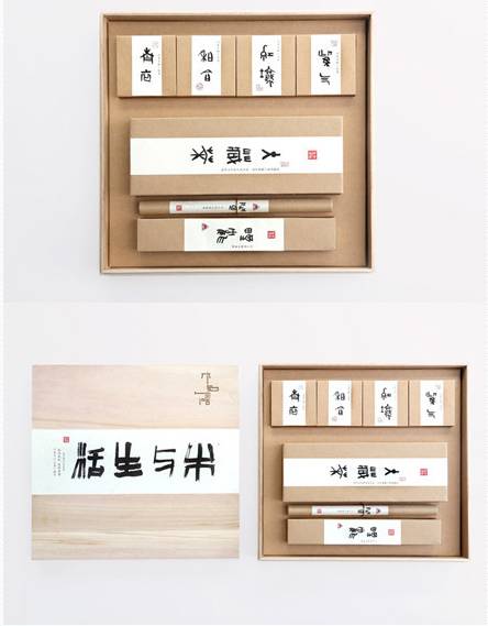
from our visual perception, if all the elements are cumbersome together, can not find the key point, it is even more difficult to understand the unique beauty of traditional Chinese characters.
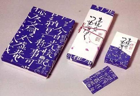
paragraph, white space, font, spacing, artistic conception … The adjustment of every small detail will make the Chinese characters express more emotion and show their personality. Just as we generally know that"Less is more" is a design criterion, but it is not the only design criterion. In Chinese character design, we follow these design methods, but not limited to this, more jumping, rhythmic design attempts, may reproduce different Chinese characters elegant demeanor.
Zhong Ling Yuxiu, the outstanding man of heaven and earth, the form of Chinese characters that has been pregnant for thousands of years, in our opinion, is the existence of beauty.
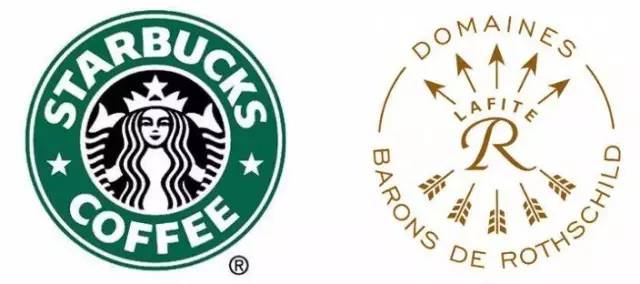
when we compare font and graphic symbol design, we do find the limitations of fonts. In many cases, when users remember a brand, the graphics will be more recognizable. Words can cross cultural barriers between countries, but graphics can not or even express more levels of meaning. For example, STARBUCKS, as we know it, still designs the iconic double-tailed mermaid Logo, such as the world-famous French wine brand Lafite, which may not immediately think of French"Lafite" at first, but can think of the five arrows in the brand logo …
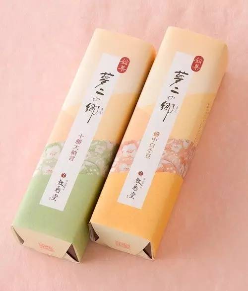
in the appearance design of the product, it is a good attempt to combine graphics with Chinese characters. Chinese characters often give people a serious, rigid, square feeling, if only Chinese characters are too monotonous, integrate into some graphic styles with oriental elements, and increase the artistic conception. Such as oil paper umbrella, paper fan, peach blossom, peony, ink, satin, cheongsam … These unique image elements are properly integrated into the design of Chinese characters, instead of dominating the host, it will produce exciting beauty, which is the power of design.
on this point, Taiwan, Hong Kong and even Japan are very representative. they really understand the quintessence of oriental aesthetics and apply them in design.
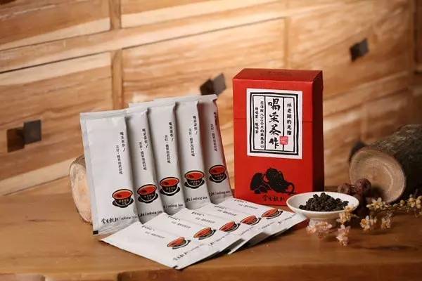
We know that there is often some disagreement in the combination of Chinese and English, just like when someone speaks Chinese mixed with English makes people feel uncomfortable. However, in the design of Chinese characters, more and more designers begin to try to integrate some English decoration, which can fill unnecessary gaps and make the overall design more three-dimensional and rich.
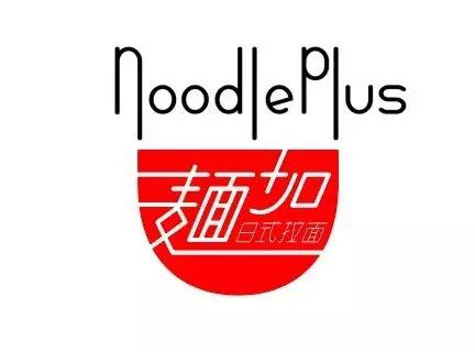
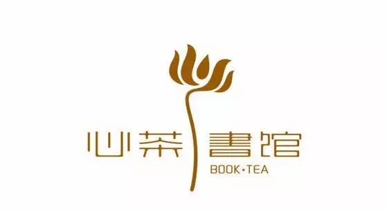
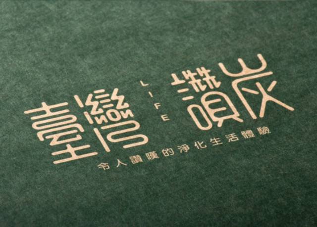
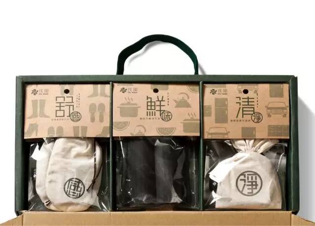
will be extremely difficult to show the Chinese character design skillfully use font font, size typesetting, graphic color matching and other elements of the integration, this is the value of the design. We don't say,"oh No, it's too hard to design." Instead, we begin to change our thinking on how to solve problems through design. When we pay more and more attention to the use of Chinese characters in product design, Chinese characters may become a new trend in the design world.