學會這幾招,字體也能玩穿越
作者:小道 编辑:道格字体&coeus
Author: Liu Baikun

There are specific marks in each era. We may feel that it is more direct. Perhaps the dressing changes in each era. In fact, people, things, and things will have the characteristics of the times, and the fonts are no exception.But how to cross the font to the past?Today, we must talk about how to make the fonts into the nostalgia and retro of the fonts from two aspects: the font change and the font effect.
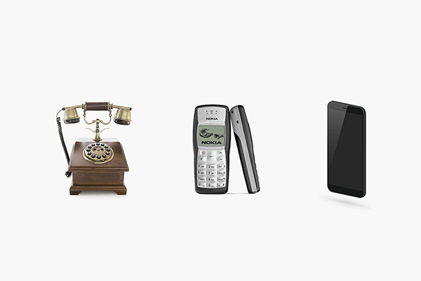
For example, we have been updated from the turntable dial -up dial -up dial to the function phone to the smart phone. From the appearance, it becomes more and more concise. In fact, we can all find similar changes in clothing, food, housing.From the past to the present day, can we summarize some major trends from the inextricable and use it?
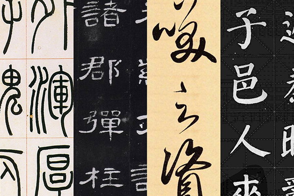
The picture above is the script, liberal script, script, and regular script in the calligraphy font. It is also the evolution process of calligraphy in order. If you feel unswerving, you can think about the changes in traditional characters to simplified characters.EssenceSo can you just "cross" the "complication" of the text style?Of course not, the following uses several examples to share several specific methods.

Many of the variables in the font design are well -founded. For example, we want to design an old -fashioned font in fact. In fact, we can borrow some writing in ancient calligraphy. The most representative of which is the scriptbook.
The scriptures have the pictographic characteristics of the text shape. Although we have lost their practical properties at the moment, we can make a certain optimization according to our own needs to achieve the purpose of ancient times.
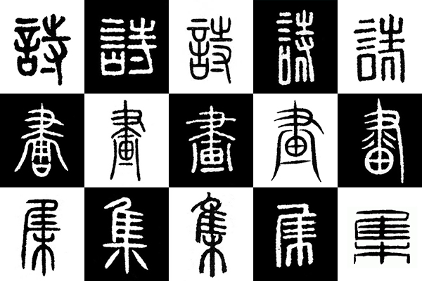
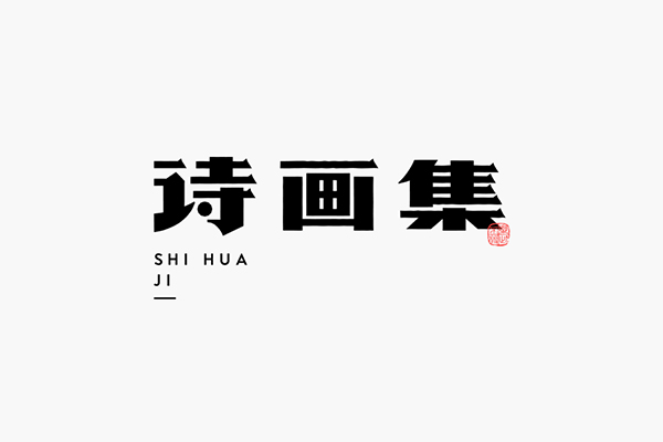
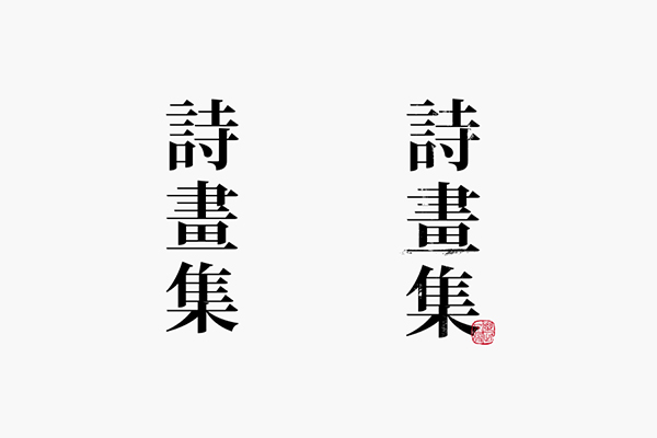
Below the word "Poetry and Painting Collection" breaks down.The text in the picture above is the writing method of "Poetry and Painting Collection" searched from the Internet. At a glance, whether it is very "complicated", even the same word will have a variety of different ways, and the structure changes are also diverse.How should we choose the right one?
a.The primary exclusion of low recognition, as shown in the figure, the first word in the figure is difficult to identify for most people;
B.There is a simplification of splicing and simplification, and there is no complete available. This is a certain choice for us, such as the "poem" in the first line in the figure.The change is a bit "over", not in line with our needs, so it is necessary to do a certain simplified treatment;
C.Be good at grasping characteristics. In ancient times, it is not to be copied, but a practical identification.
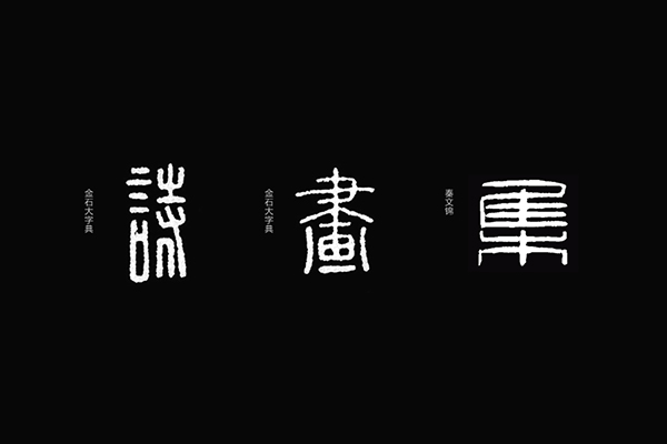
As shown in the figure above, I chose the three words in comparative meaning. According to the few standards mentioned above, it is obvious that the first word will be eliminated, but what I value more is the pen next to the "words" on the left. Of courseDo.
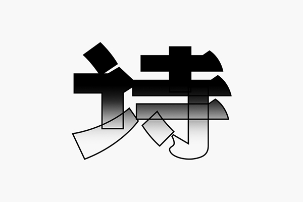
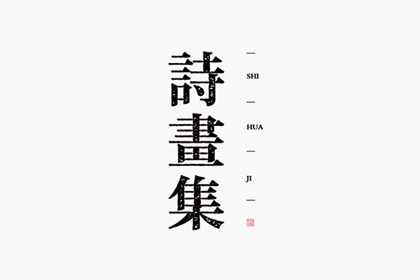
The first step is to outline the structural framework according to the lines above. The last word compared to the previous words is relatively flat. During the process of doing, it is necessary to raise the unity of three words.
As mentioned earlier, this method is not completely copied. Let's take a look at where there are some adjustments:
a.The structure on the right of the poem is replaced by the form of simplified characters, maintaining the recognition of the text;
b.The strokes are straightened from the song. For example, the horizontal strokes in the original character have a certain arc. All of them become a straight segment first. This is to make the overall order more reasonable. Of course, there are exceptionsOne vertical pen.
c.Compared with the previous structure, it is taller, especially the last word changes are the most obvious. The height and thinness should be adjusted accordingly according to the meaning of the fonts you made.
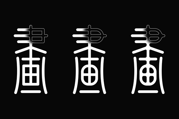
Only the construction of the structure is definitely insufficient, and the details of the details must be indispensable.The strokes of the equal line itself are relatively direct, and some rounded treatment can be added appropriately, which is more in line with the font characteristics of the script.As shown in the figure above, the first word did not do any treatment, and the second pen -drawn corner changed from the original right angle to a rounded corner treatment.The third word has increased the internal rounded corner from the front, so that the pen drawing has a little frustration and more durable.

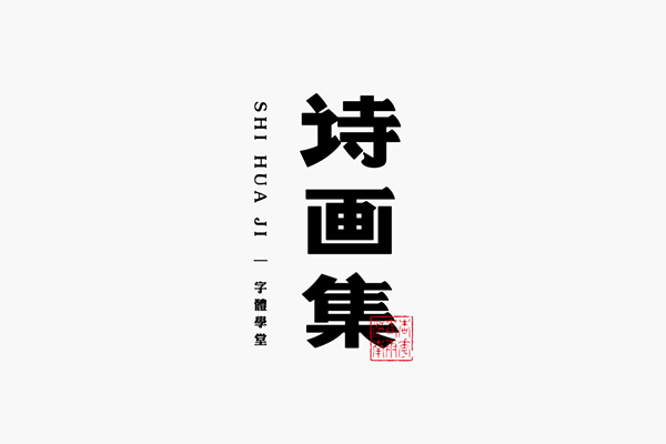
Color and layout are also part of the details. Finally, the dark blue and red seal are used to embellish it. A set of retro but also in line with modern people's aesthetic text design is completed.This method of using ancient and present is very simple, but in addition to the precautions mentioned above, the uniform and orderly configuration of the font is also a vital part. Any word is the case.

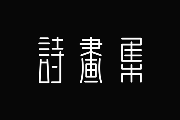
Just like the TV series, the scene of the scene can be restored as much as possible, and the films that can be shot can have a stronger sense of substitution. The most direct and effective way we want to design the font of the age is to restore the font characteristics of that era.Similar to the principle of the first way, but it is actually a bit different.Below we traversed from ancient times to modern times, or the word "poetry and painting collection".
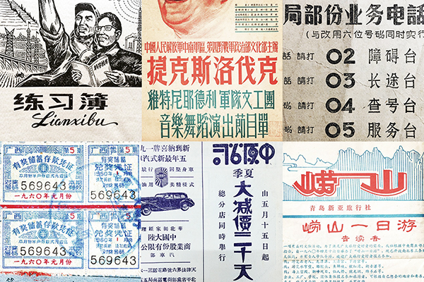
There are many pictures about old fonts on the Internet. I usually have to be preserved when they meet. Maybe it will be obtained, and it does not matter if it is not stored. Our font school public account will be updated from the old characters collected from time to time, so that everyone will learn for reference.
The sense of age of the old characters In addition to the mottled paper, the characteristics of the font are the characteristics of the font. The other is the other is the application of the Song style characters.Sex, this is also a major feature of old characters.
The first step is the extraction of conventional strokes. Due to the age and other factors such as shooting, many font details are blurred and uncertain. Do not change the font details caused by objective factors.Border optimization.

Some of the strokes we need may not be in the old characters. At this time, we must expand the strokes according to the style of the old characters. In addition, the corners of the strokes in the old characters will not be sharp. Generally, there will be a little round corner.Not straight, these can be added in the later period, do not add from the initial strokes.
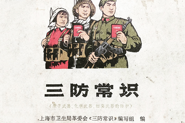
Basic strokes can be set up in the next step. In addition to the borrowing structure space characteristics of strokes, we can also refer to the word "three defense common sense" as a whole.The characteristics should be grasped.

Basic strokes are not static, like the "set" horizontal strokes. If the original horizontal stroke is kept thick, the space will become very crowded and not beautiful, so the horizontal strokes are detailed;There will be differences in it. This requires everyone to know more about the glyph structure and "live".
Finally, as shown above, in fact, the foundation structure is built to the final font. The result you see is only two steps. During the period, there are many fine and repeated adjustments.
This method will be addicted, and there is another group in the word "soda".The process will not be repeated as above, and the results are directly depends on the results.

The two old -fashioned strokes selected today are not the most characteristic, and some personality is even more prominent. Everyone may wish to try it to see if it is really as simple as you see.

If you usually have no time to design and want to "cross" it quickly, there are also, so the font effect creates a superficial sense of age. It is not very detailed because it is the basic operation of the software.
a.Gravity superposition
最简单常用的肯定是各种Gravity superposition,甚至这是很多同学做年代感的文字必备选项。如上图,左边是常规字体字体,右边以此为基础叠加纹理。说两个注意点:一是纹理不在多,要避免纹理抢风头;二是纹理也有虚实对比,不可做的太平均。
b.Rough outline
Use the same font word to use [Roughization] in AI software to achieve rough treatment of the contour of the font. To master the two value changes in the rough creation, you can also create the texture changes inside the font through the path shift to make the font change, so that to make the font make the font, so that to make the font change to make the font change to make the font change to make the font change, so that to make the font change to make the font change, so that to make the texture changes to make the font change, so that to make the texture changes in the font, so that toastThere is even more mottled years.
If you share above, you will find that the font design of the age is relatively complicated from the inside and outside. At the same time, you must be good at grasping the characteristics. Several ideas will help everyone sort out. Have you gained a little?