作者:小道 编辑:道格字体&coeus
Edit: Onion Author: Qian Hao Hawking
Lines are the most basic part of the font. In addition to the straight line, the drawing of curves has become the focus of writing, and it has also become a big difficulty.The quality of the curve directly affects the pros and cons of font works, and has previously written an article about curves."Why is your curve so good in the nine -year compulsory education?"
But many students are still confused. I do n’t know how to start, and cannot distinguish whether the curve they draw is correct?Sometimes it takes a long time or a day to adjust the curve, but the effect is still very bad ... The heart of "dead" is!
Let's talk about it in detail and draw the trick of drawing curves.
What kind of curve is comfortable
The word "comfort" is relatively abstract. We cannot formulate a standard to measure the curve you made, which is comfortable to give people feelings.But you can summarize some rules to help everyone make a target to make a less inferior curve.
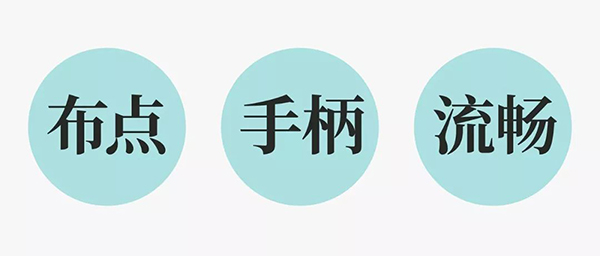
I sorted out three tricks: cloth points, handles, and smoothness, which may be too abstract, and then listen to me.
1.
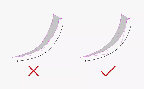
First of all, the "cloth point" refers to the position of the anchor point. For a large -scale spiral curve, the anchor point is distributed at the extreme point of the curve, that is, the horizontal and vertical point in the curve, which is in the flower of the Western language.It can be seen intuitively in the body, and the distribution of the anchor point should be uniform.
In the Chinese font, we can understand the skimming and strokes as a curve. In rare cases, it will make a large -scale curve like Western flower bodies. At this timeJust take the two ends of the curve, don't take the point in the middle.
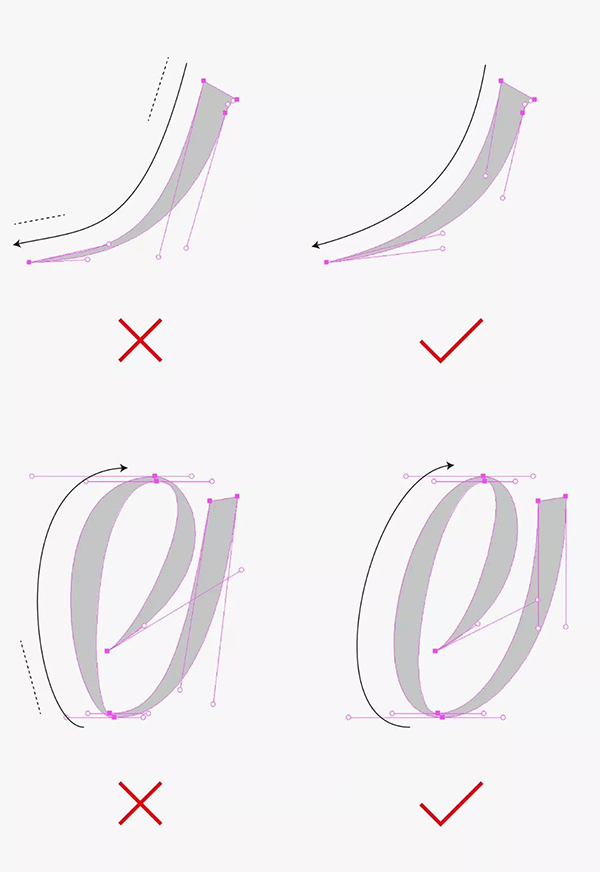
Second, handle
Secondly, the "handle" refers to the control rod of the anchor point, which can also be divided into two cases. For a large -scale curve such as the flower body, the handle of both ends must be extended.Short, the length of the handle of both ends is easy, so that the curve drawn will be smooth.
For small -scale curves, it can activate only one end of the handle, which can simplify the difficulty of drawing curves, thereby improving the efficiency of our adjustment of the curve.
Three, smooth
In the end, the smoothness of the curve is the most difficult for beginners. It is not ideal to adjust and tune until you exhaust your last patience, you can only get it ...
In fact, this is not so easy for designers with some experience. It takes a long time to adjust it to the ideal state. Among them, there are still some skills to help everyone determine whether the curve is smooth.It is to ensure that there should be no straight -line form in the curve, so that the curve drawn will be smooth.
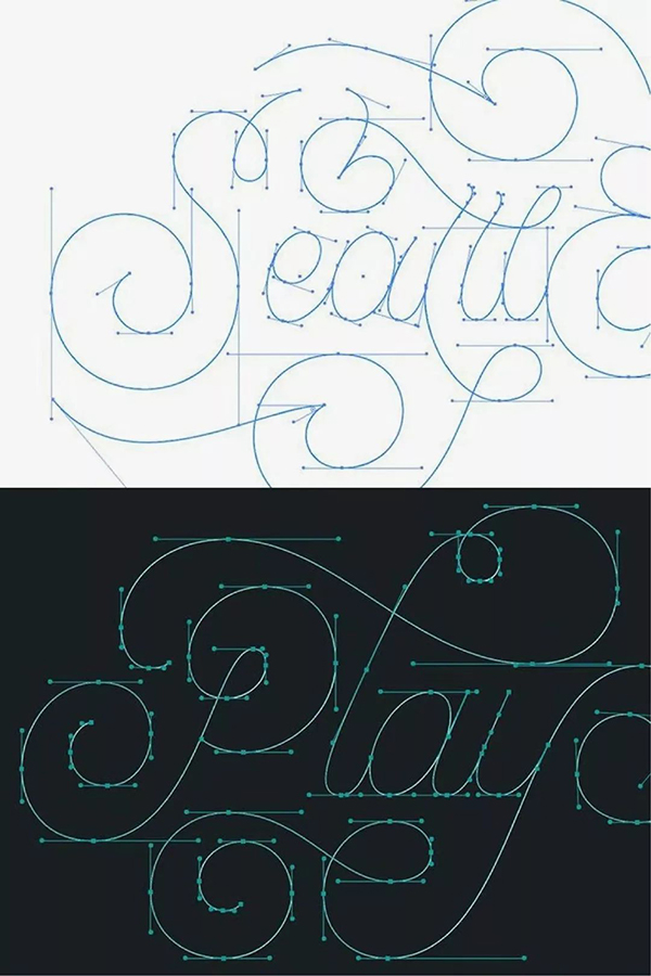
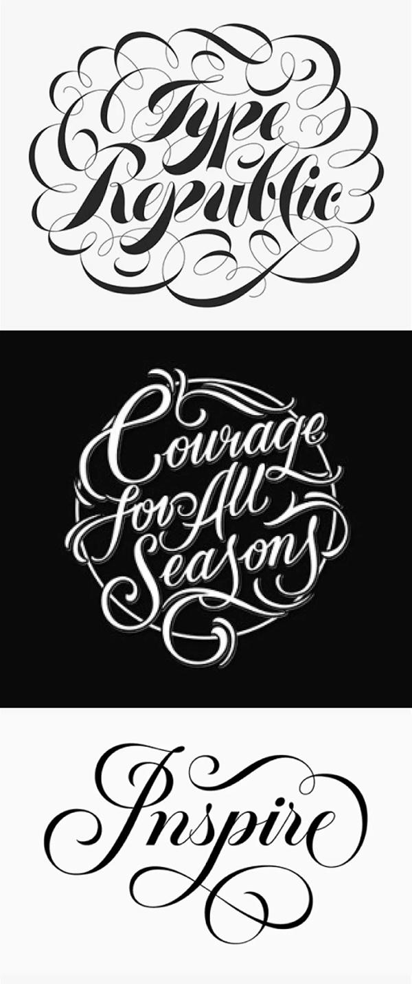
The western -style style works listed below have no problem with the cloth and the handle, but the smoothness of the curve is very unsatisfactory, and the problem appears in his curve., Harder.
After all these three points can be done, you need to do some copying to achieve skilled purposes. You can find some Western flower bodies for copying.
In this way, the quality of the curve drawn by everyone must have a qualitative leap, and it has increased a new skill that distinguishes the advantages and disadvantages of the curve.
After understanding the three points that need to be mastered, the following, the following, the explanation of the proposition cases in the three "character schools" and "one week" activity, summarize the four techniques, let everyone deepen and eat through the principle.
Use the drawing style
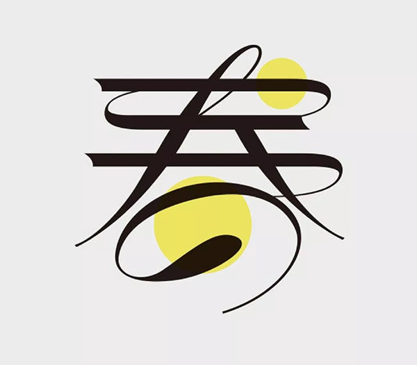
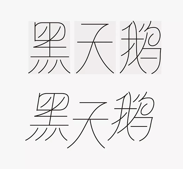
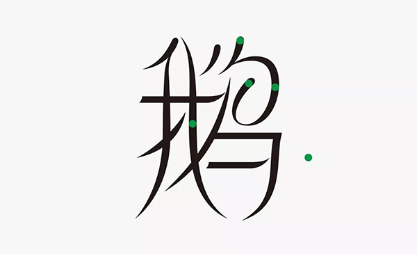
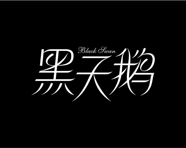
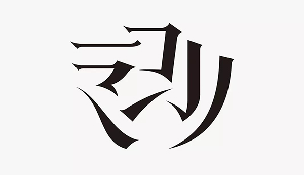
"Black Swan" from the words, the use of curves is not suitable.If there is no good idea at this time, if the brain is blank, we can find some font works as a reference, draw nutrients from it, and turn it into ourselves.The word "spring" below must have seen it. The quality of the curve in his word is very high. The most conspicuous is the handling of the word "day", which is also a highlight of his work.In addition, it can be observed that his main body of horizontal painting is straight line. This is currently to highlight the highlights, so that the glyphs are divided into the main and secondary, and the level of the font is enhanced.
For some people who have no hand -drawn ability, you can use the painting to draw the skeleton and curve of the font, and then the flesh will be raised by the bone, which will improve the efficiency of the word.
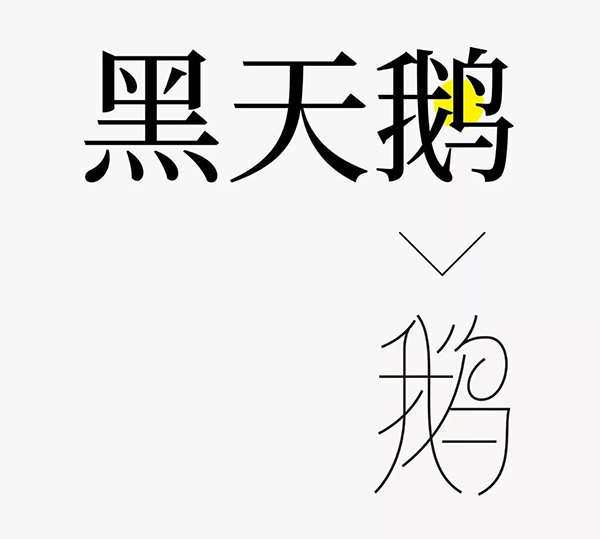
Let's observe the structure of the words "Black Swan". See where you can join the processing method of the word "Japanese" in the reference work.In these three characters, none of them contain the "day" glyph, and can only be tried to simplify other structures to achieve it. Among themWords start.
The upper part of the "bird" in the "goose" can be simplified into the "day" shape we want; all the drawing at the bottom is adjusted to the curve shape to achieve the effect of enhancing the characteristics of the curve, but the arc of the curve is according to the glyph shape.The shape of the form itself is different, so the arc is different; simplified the word "bird" in the dense strokes; in order to emphasize the characteristics of the painting, adjust the point painting of the word "me" to the skimming; finallyThe softness, choose a large amount of strokes, adjust it to the arc, and increase the center of gravity of the font, and collect it in the middle palace.
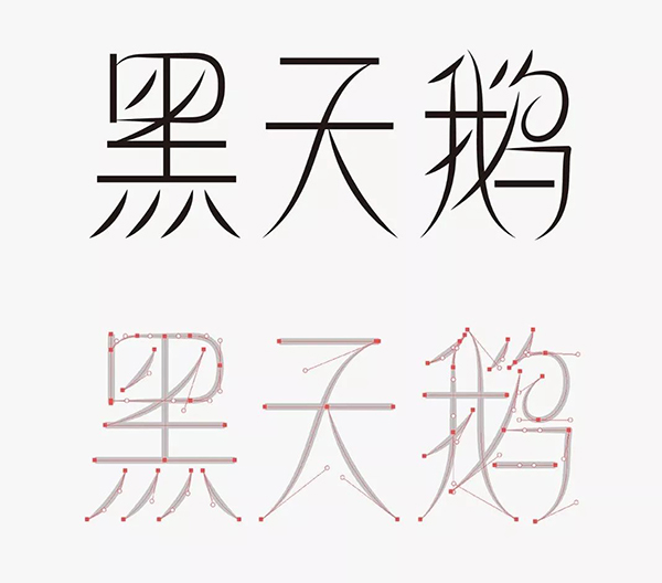
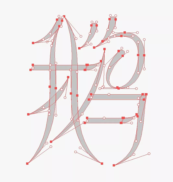
Take a detailed look at the path status of the curve in the "goose" skeleton.
In this way, the word with the most strokes determines the literal size. On the other hand, we design the first two words, and the characteristics of skimming and arc must be reflected in the other two words.Therefore, in order to increase the shape of the painting, the direction of the "black" point painting is adjusted.At the same time, the arc is added to the word "Tian".
In this way, the preliminary font skeleton is designed. In fact, this can be used as a complete manuscript.
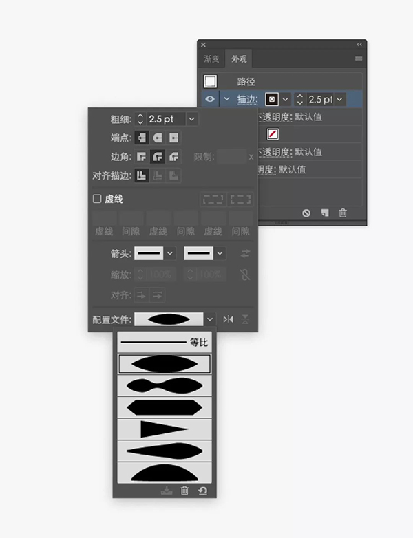
A. "Scroll Width Configuration Style" can reduce the difficulty of curve
Next, you can use the built -in width configuration style of the software.
Adjust all the painting forms in the glyph, which can simplify our difficulty to make this kind of curve to a certain extent.
After the strokes are uniformly transformed, the short -handed painting is adjusted to the "tear drop" form.
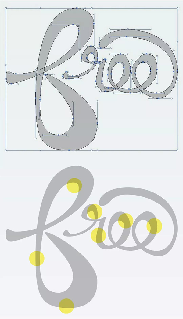
The focus is on the adjustment of the large area of the "Bird" character. This curve will be beautiful to add thick details at the turning point.
B. "Ellipse tool" auxiliary measurement curve width
Among them, for the width of the curve strokes, many students are not controlled. We can use the "ellipse tool" to remove the width of the vertical drawing in the font and use the circular shape as a tool for the width of the measuring curve.
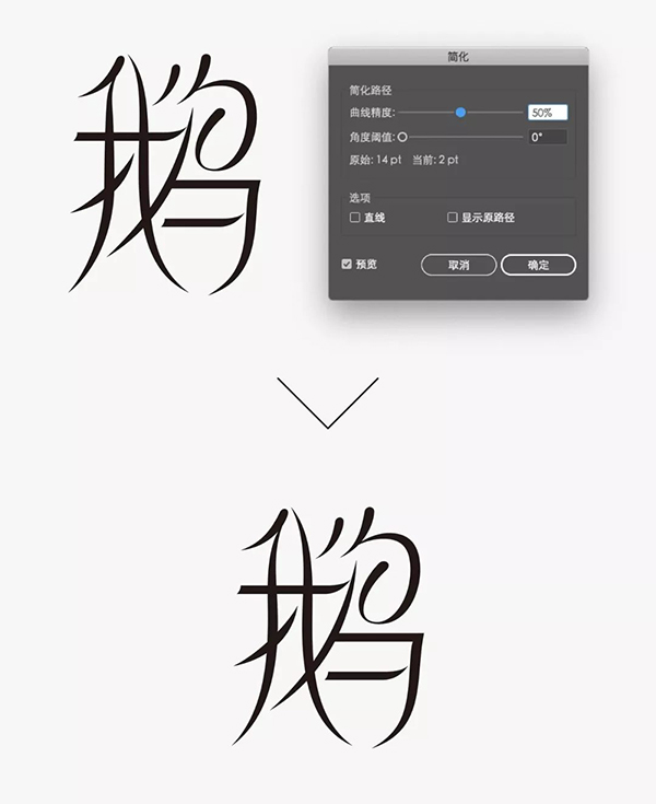
For strokes that configure the style of the drawing width, we need to simplify the path before the transformation can be adjusted before adjusting the curve.
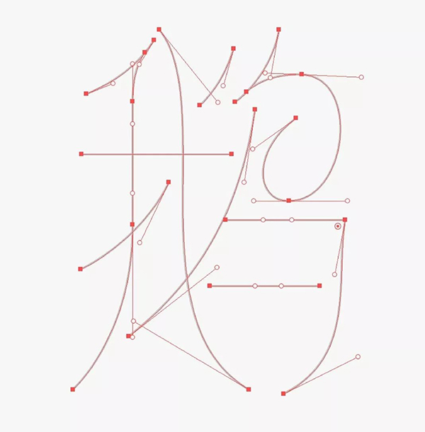
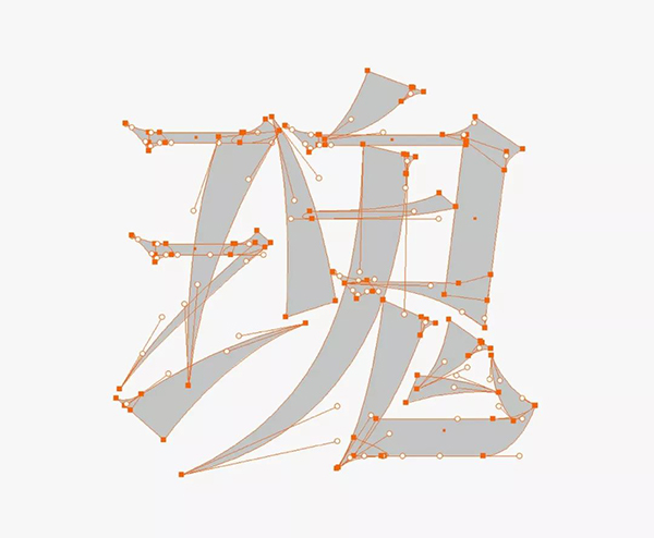
Look at the path diagram of the "goose" alone.
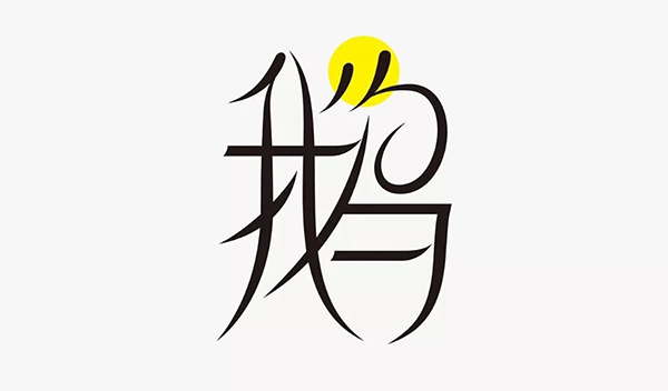
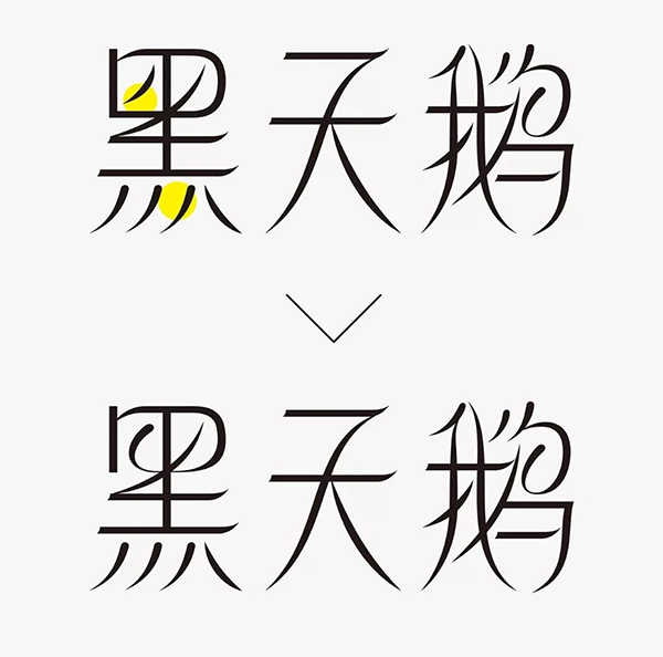
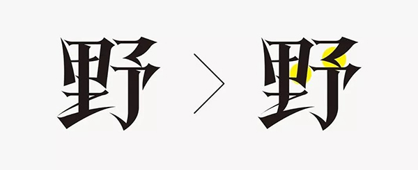
After the initial completion, observe that the word "black" is obviously uncoordinated with other words, the problem appears in the "mouth" shape of the "black" character. It can just adjust it to the form of the highlight.The glyph effect is much harmonious.
Finally, the glyphs are tilted as a whole, or dislocated to make the shape more full, and the western gramor is added, so that the design of the case is over.
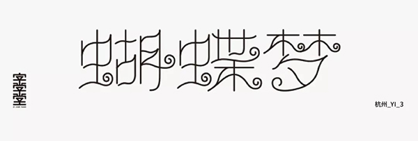
Partial curve
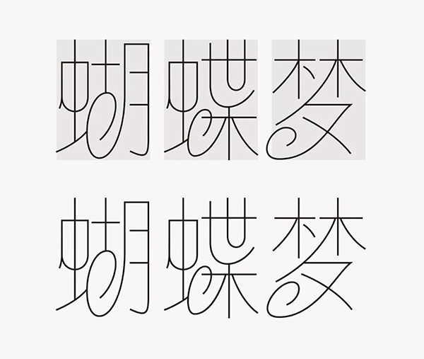
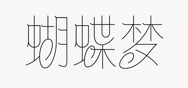
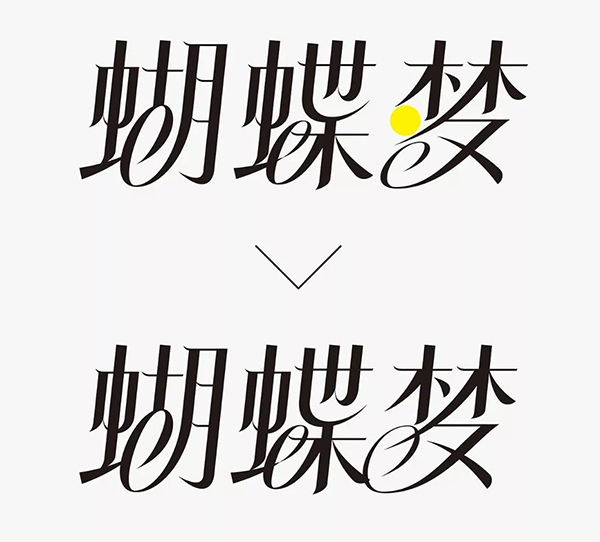
We designed with "Butterfly Dream" as the content.Sometimes when everyone involves curves, some students will adjust all strokes to curve forms. If you have a poor ability to adjust the control, this is undoubtedly digging for yourself., Adjusting inadequate glyphs will look loose and weak.
We can take a different approach. Do not let the strokes have curves, and only keep some strokes with curves. The difficulty coefficient of this design will be reduced a lot, and the glyph will produce a sense of layering, thereby achieving a beautiful effect.
Let's take a look at the structure of the three words "Butterfly Dream" that this time is made. There are many strokes in the first two words, especially the word "butt". You can consider simplifying the use of strokes.
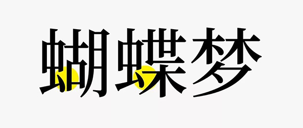
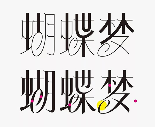
C. Soft and hard to highlight the curve
The word "bow" is designed by the edge of the border. The glyphs are overall to ensure that the upper end is hard and the lower end is soft. It only uses a large range of curves in the simplified area. In this way, the design of the design is changed in the unity.
Then design the other two words, which will simplify the spiral pattern of the simplified role, as the main highlight of the entire group of characters, to ensure that there is one of each font. Among themExtend the skimming painting, so that the highlight structure of the font concentrates the bottom of the font.
Add a tiny arc to the stroke of the horizontal drawing to further enhance the characteristics of the shape of the shape.
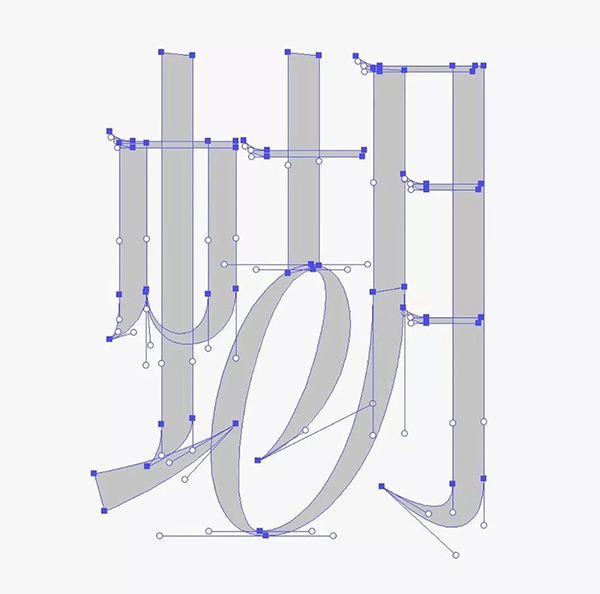
Next, the bone -raw meat can be widened first to widen the vertical painting in the shape of the edge to determine the width of the vertical drawing, and then adjust it uniformly.In order to control the width of the curve, a measuring circle can be made. The spiral line of the "Dream" word does not play a role in replacing the strokes, so the width is set thinner.The form of the remaining basic strokes should also pay attention to the fluency of the curve.
Look at the path diagram of the word "bow" alone.
After the glyph is unified, it is found that the word "dream" is not full enough, so the range of the spiral line is increased, so that the overall effect is much harmonious.
Through simple graphics adjustment, the interspersed relationship of the spiral line enhances the interspersed relationship, making the curve a lot clear, and with a western font with similar characteristics of the glyphs, the design of the case is over.
Beauty of curve
The above two cases contain a spiral structure. In fact, the frequency of this structure is not very high, and more is the beauty of the curve of the font structure itself.
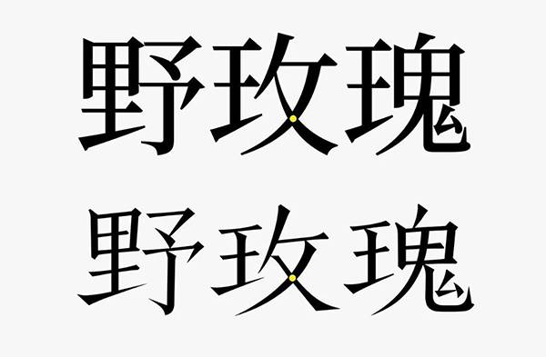
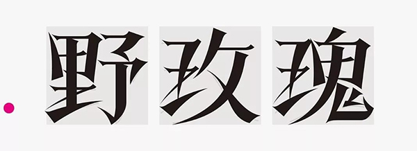
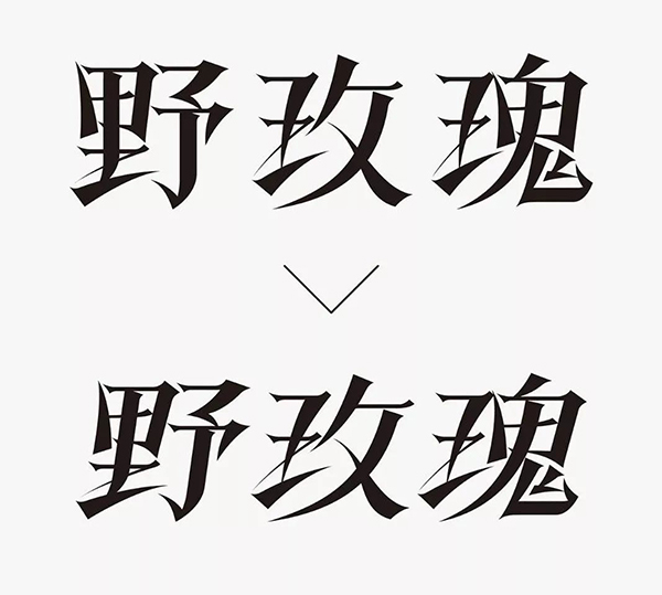
We designed with "wild rose" as the content, focusing on shaping the curve of the glyph itself.Also observe the structure of the font first, combined with Song engraving, create a handwriting feeling.Pay attention to the impact of "Mei" on the center of gravity.
The skeleton of the font is also designed by the edge, and some of the vertical paintings are adjusted to the curve structure to create a handwriting feeling.
After the structure is determined, the sharpness and exaggeration of the stroke form are set.
Assist the stroke structure as auxiliary, add the body to add it.
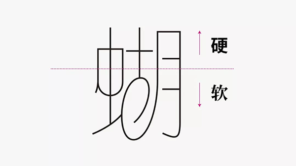
D. Do not overwhelm the thickness of the thickness of the curve strokes
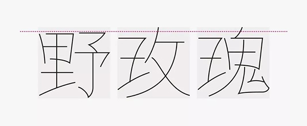
This curve is the curve ends at the end of the end. Remember not to take the point in the middle. Pay attention to the effect of the curve elasticity of the curve. The following figure can observe the path diagram of the lower glyph.Among them, the thickness of the thickness of the strokes of the skimming and 类 curves must be coordinated.
Concentrate to adjust the word "wild" that is not ideal in the interior structure and curve.
The glyphs are tilted as a whole, and the distance between the font is adjusted to make it more compact.
The designed design that is more wild and wild is over.
The above I sorted out 3 tricks and 4 techniques, and through three cases explanations, from shallow to deep, I will introduce to you how to draw efficiently in the curve in the font. I hope everyone can target and no longer lose the direction.
The above -mentioned reference works are not signed from the Internet
at last
You turn to me, comment, praise
I can eat full meal
Thank you everyone!Intersection