坤哥改字 × 中式地產標準字應該怎麼改?
作者:小道 编辑:道格字体&coeus
Edit: Onion Author: Liu Baikun
Foreword: The word changing is like a half -proposition composition. The material gives me as a narrative as much as possible.It is not significant to help you change your words. This is not significant. I will try to maintain the original font direction, solve the main contradictions, help everyone clarify ideas, and expand some small knowledge points.If you feel that there is something wrong with the word changing, please leave a message to discuss.


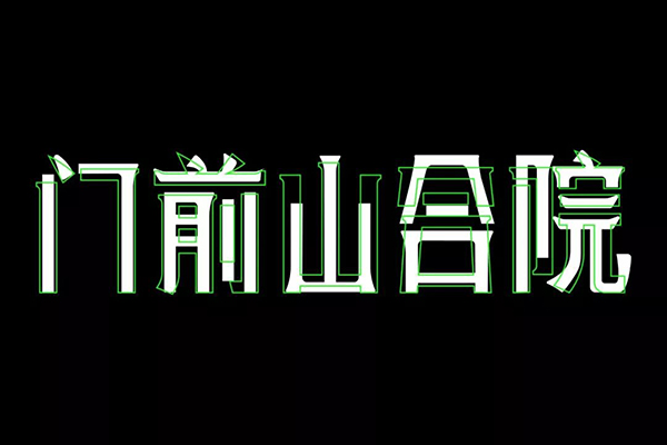
This issue is the seventh issue of Kun's words. Choose a set of Chinese glyphs that seem to be more Chinese. Similar fonts are more common in some real estate industries. You can feel the original manuscripts first.

The tall structure is impressive, and the small decoration of strokes makes the atmosphere of the entire set of characters good. The basic strokes of the original draft characters are also more concise.However, it has been emphasized many times before. What is more important than strokes is the configuration of the font space. Some local space control of this group of characters is not accurate enough. It seems a bit lazy. It may be more spiritual.
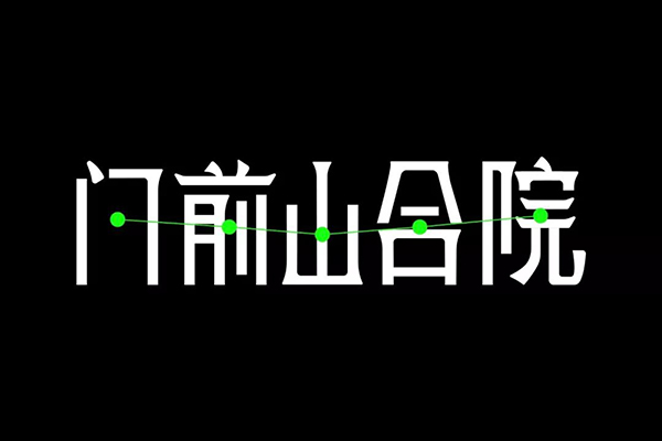
The bottom of a set of fonts is very easy to align, but the height is not easy to uniform. Of course, this height is not an absolute high point alignment, but a visual unity.In addition, the word "mountain" is like the "basin" of the whole group of characters, and the visual center of gravity is relatively low than other characters.

So where does this set of words be changed?Essence
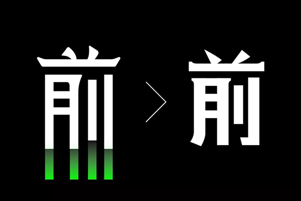
Some words will be arranged in a few consecutive vertical pens. Like the "front 'above', the original author simplifies all the bottom pens into bald and unchanged. This will cause the local space to be rigid.Some changes, as shown on the right side of the figure above.
In addition, the two points at the top of the ‘front’ are a bit 'Shun Touring'. This place can be changed according to the writing pen.
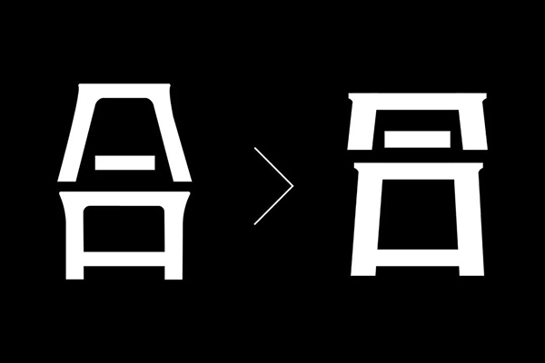
The space processing of the word "combined" was very interesting, as if the space divided the world from the middle of the intermediate limit. It seems that there is no big problem to see it alone. If you put it with other wordsTaking the overall adjustment of adjustment, the spatial distribution after adjustment is tightly loose, in order not to seem rigid and deliberately poured in the ‘mouth’ left and right strokes.
The two places mentioned above are relatively obvious changes. The others are some small adjustments. You can observe the comparison before and after the adjustment above.
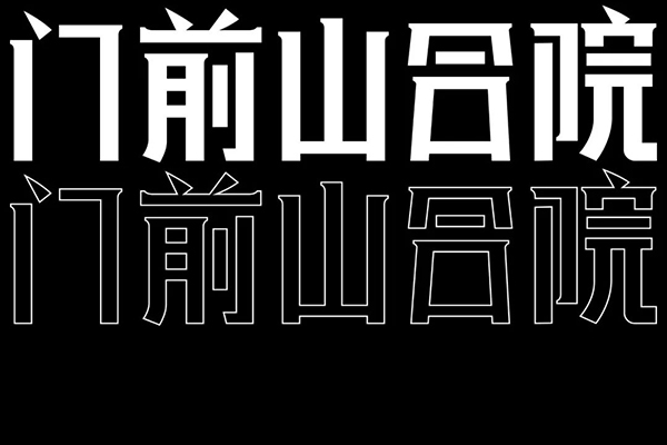
These words are not too difficult to deal with. The adjusted font state is completely different from the original word. Just like what the original word is said, I want to change the state of laziness before.Lisuo a little bit.
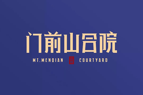
Finally, a little decoration is added to make the picture richer and more complete.Let's take a look at the comparison of the final draft.
This issue of Kun's words in this issue is here. The final adjustment of the guest officials can be satisfied. If there is any dissatisfaction, you can leave a message to me. Welcome everyone to continue to vote for me. Goodbye next time ~