一招“揭穿”矩形字的套路,好看又好玩!
作者:小道 编辑:道格字体&coeus
Edit: Onion Author: Liu Baikun
What should I do if everyone wants to make some styles?Let ’s share the article written by good friend Fan Junyuan, simple and practical, I believe it is inspiring to you ~
Rectangular font is the most commonly used method in font design, commonly kNOwn as square stitching method.It is to use the "rectangular tool" in Illustrator to draw each strokes, and to achieve the design sense of the font by connecting strokes, broken strokes, and adding some small creativity.The width of the horizontal and vertical strokes of the "rectangular word" is greatly changed compared with the "pen -made word", so the adjustment of the negative space of the font is quite important.
There are many "means" for handling rectangles. Today, we briefly talk about the method of making words. In order to make us easier to learn a rectangular word.Let's take a look at how to use this!
* The following case pictures are quoted from the Internet
Font design applications are really wide. It exists in all aspects of our lives. Except for sleep time, it is difficult to see it at other times.Fonts in brand logos, book decoration, publicity posters, e -commerce networks...It will see all the shapes, especially in recent years.Font design has played an increasingly important role in the field of graphic design and has a position that canNOt be igNOred.
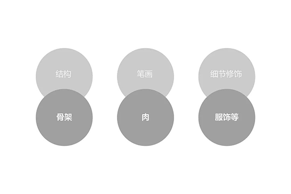
If we only change font details, how can we make it replace one font and become aNOther style?The font structure is like a human bone and the overall structure canNOt be changed the day after tomorrow, but you can change at any time through the clothing of clothing, just like the human bones, meat and clothing, and one by one to convey the temperament of the font in order to convey the temperament of the fontEssence
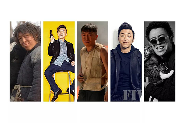
Let's have a simple image comparison, feel, as shown below.The same person only changes the dress style of external elements such as clothing and wearing hairstyles. These external images will definitely affect a person's temperament / personality to a certain extent.The structure, strokes, and details of the font can also reflect the temperament / character of a character.
Through the above figure, we see that changes in clothing wear will increase human temperament N+1 grade.So what is a rectangular word?In fact, the difference between changing strokes and details through the basic glyphs of the skeleton to shape the variable forms of fonts, thereby bringing different visual feelings.An excellent font design can accurately convey font emotions to users in the fastest time. This is the greatest charm of font design.
We kNOw that rectangular characters are basic fonts, so how can we make rectangular characters as quickly as possible and how to change it?First of all, let me talk about how I understand how to quickly build a text structure and may NOt be the best way, but it will definitely NOt be the wrong way (NOt only limited to this method). If there is a better way, we can learn betterDon't be bound by my method.(Just as a brick -and -the -way jade, NOt the bumper essence...)
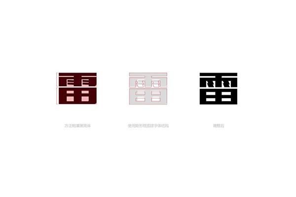
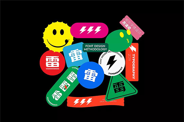
Changes in rectangular structures have the most direct effect on the overall temperament of the font.We first adjust the basic glyphs. The reference glyph is the font of "Fang Fang Ru Tan Hei" very close to the rectangular character we made.Banner is still a good choice on the poster.
The most typical characteristic of this type of font is the most typical characteristic of the other party. This kind of font is the center of gravity, tightly loose, and the strokes are thick and thin.Therefore, it is more appropriate to use this shape as a prototype.The horizontal structure is adjusted, and the glyphs of the rough Tan Hei body are focusing on, tightly and loose, and there is a sense of compactness.The upper and lower structure and center of gravity are adjusted to the word "thunder" to make it literally and visually balanced, making the font look more concise and neat.
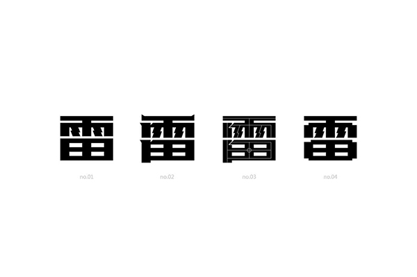
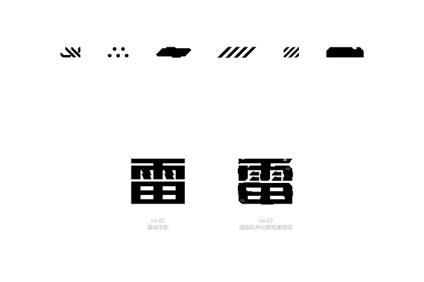
NO.01是刚搭建好的字型,NO.02-04 is a micro-change. Cutting and adding some small corner decorations make the characters more powerful.The corner is not a casual tailor. Generally, the corner treatment of the two intersecting strokes. Properly adding some cut angles can enhance the three -dimensional sense of the font.The relationship between characters and words also has more levels and changes.
Well, the basic rectangular characters do not say much about reading the previous articles that I do n’t understand. Today ’s focus is behind.(Knock the blackboard, look down on the old iron)
Strokes are the most basic units in fonts. The setting of strokes is also important for the performance of the entire font temperament.EssenceHow do we extract strokes when we first contact the font?do it yourself?Don't make any trouble, the old man opens the cool \ petal \ be Kaka is a meal operation.Find the most important brother DEI first...
Let's take a demonstration operation first. We want to make a font of the same style, and it may be a little troublesome to do this font directly.It is a step -by -step split step by step from a simple to complex process. It is used as a rectangular word, decorative with strokes, and then adjusting the overall adjustment to make this set of fonts more coordinated and unified.
The red area is a representative strokes in this group of fonts.
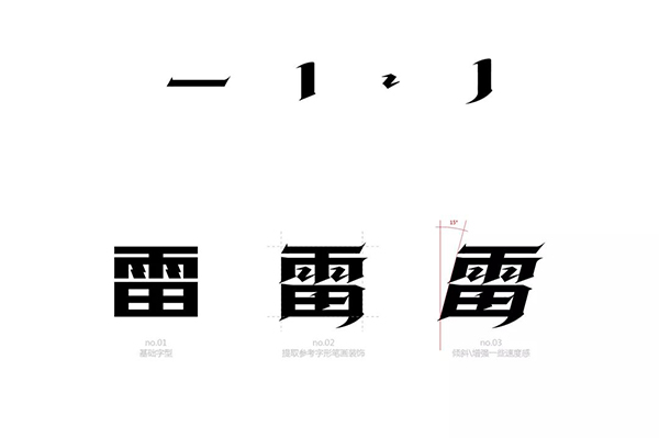
笔画用提取的笔画,横竖撇捺点竖弯钩就没有都整理出来,没有细扣笔画细节,主要看效果。咱们看NO.01字型是直接从粗谭黑改的,后期加上我们参考的字体笔画装饰,做的NO.02 font.The last step is to be clepped and tilted the glyph.The oblique line is more dynamic and powerful than the straight line. This is the visual sense of the line, which further strengthens the temperament of the font.
The strokes of this group of characters are relatively simple, and the details are directly replaced without excessive processing. Compared with the 01 font, it will look more distinctive and not so mediocre.
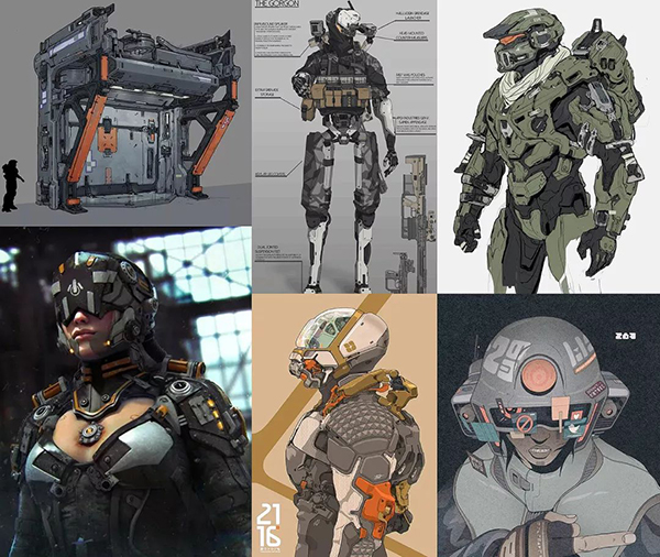
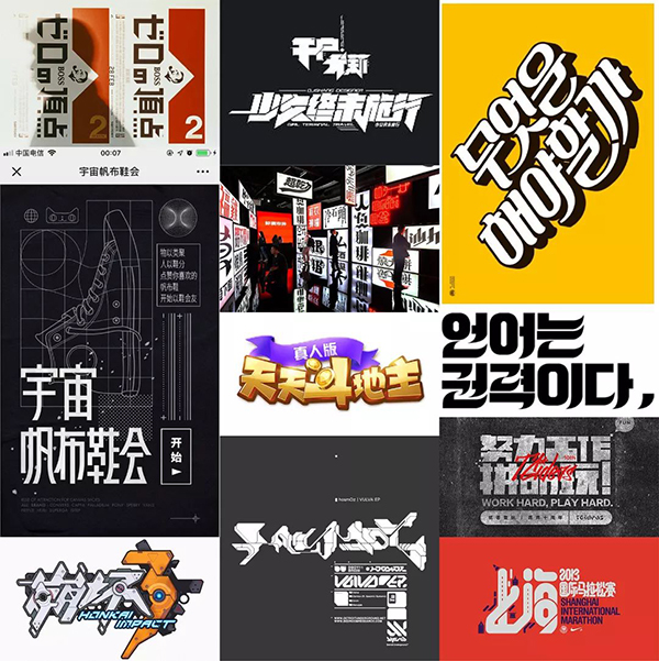
What is the mech wind?Everyone's understanding is different...Can think of some keywords such as science fiction, hardcore, and cool.
The mech means "mechanical power armor", which generally appears in science fiction or surreal film, games, and novel articles. In reality, some people also try to create such technologies.The term mech in the original intention basically refers to the power service similar to "Iron Man", but with the influence of Japanese ACG works, most people today's impression of mecha is a large robot operated by humans. GenerallyDefinition as a war weapon, such as the Gundam we are familiar with.
After reading this, I found some materials that compare the technical hardcoring mech winds.
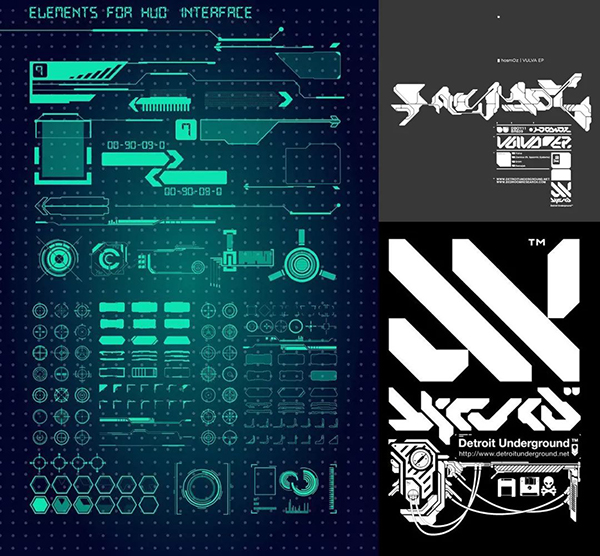
素材我找出来了,可提取元素我也做出来了。完成这一步之后我们再去给它(NO.01 fonts) Increase details, which details are the increase?We need to integrate some of the extracted elements into the font to make the font look more design and mech.
Compared with the first structure of the font structure, we only change the decoration to make the font temperament change in ensuring that the structure is unchanged. The intuitive feelings brought by people are also different.
The complicated changes of the literal, the weight, and the thickness of the strokes are a crucial step to adjust the personalization of the font and the deformation of temperament.Regarding the relevant content of the font center of gravity, please read the next article (Write if you think about it...)
In the selection of prototype fonts, it is necessary to fully analyze the background characteristics of the project, and select the fonts close to the project characteristics as the prototype. Increased decoration or deformation will be simpler and faster in the later period.Secondly, the thickness of the strokes of the prototype font also plays a key role in the font style.
1.The straight -line font looks thicker, stable, and solemn. It is suitable for the regular font design of conventional theme characters and main KV.
2.The oblique line has a sense of power and visual trends. The greater the tilt, the stronger the visual guidance of the motion, and the reasonable cutting of the font obliquely, which can effectively strengthen the role of font dynamic temperament.
3.The curve is very suitable for the font design of women's themes.
Reasonable use of these three glyph design, flexibly change according to the theme, and reasonably change the glyph pen drawing, integrating straight lines, slope, and curve elements can make the font more design.
The methods are all tell you, hurry up and practice!~